
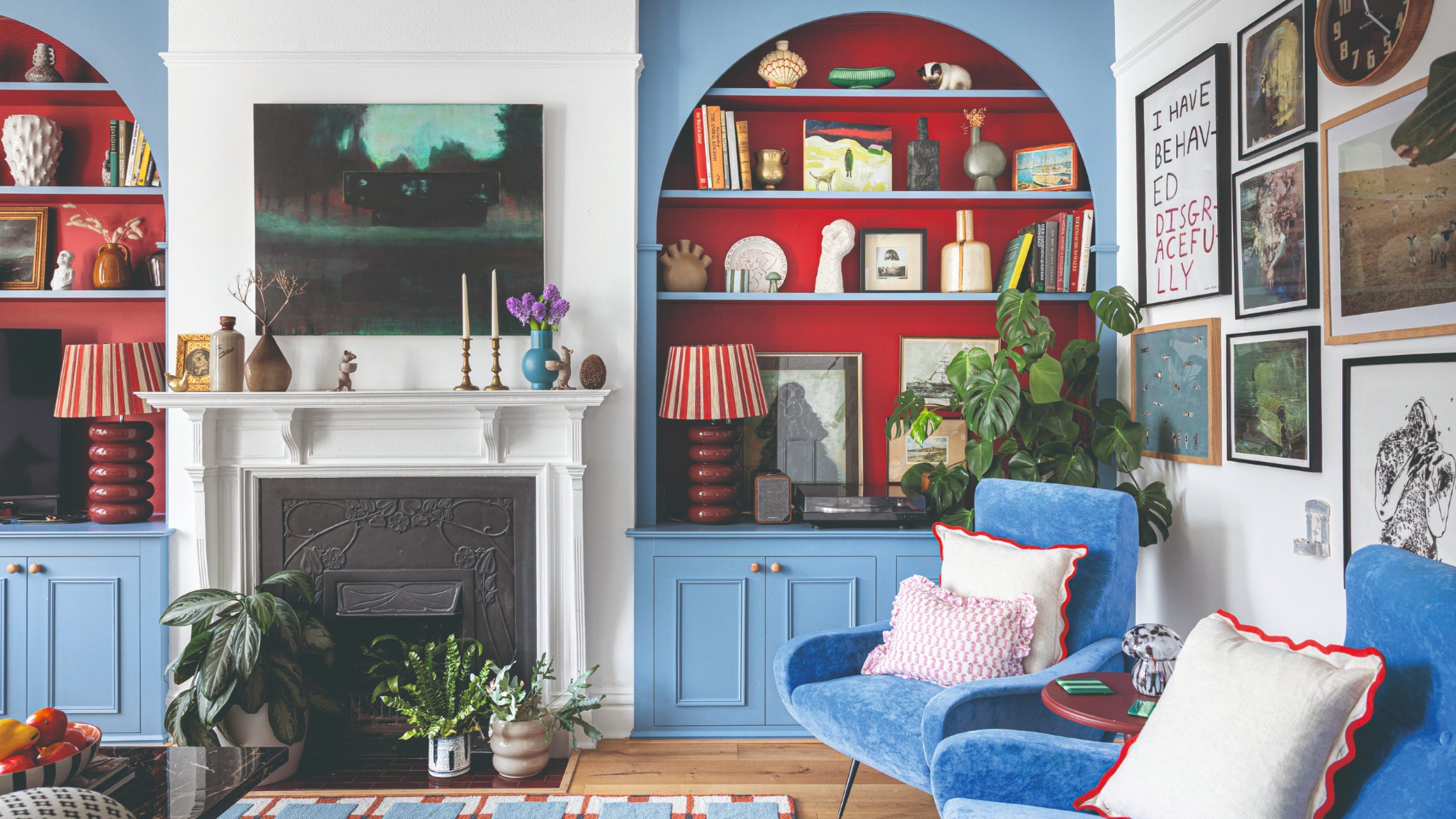
Choosing colours for a home is about more than picking a shade that looks attractive on a paint card. Natural light, room orientation, furniture, flooring, ceiling height and artificial lighting can all influence how a colour appears once it is on the walls. The same paint can look noticeably different from morning to evening.
For homeowners planning a decorating project, understanding these factors can make colour selection much easier. Experienced Decorators in London can also help homeowners consider the practical characteristics of a room before committing to a particular palette.
Why Colour Choice Matters
Colour can influence how spacious, warm, calm or energetic a room feels. Light colours can help reflect available light and create an open appearance, while deeper shades can introduce character and make larger spaces feel more intimate.
However, there is no single colour that works perfectly in every home. A shade that looks warm and inviting in one room may appear cooler or darker in another because the lighting and surrounding materials are different.
This is why colour should always be considered within the context of the complete room rather than chosen from a small sample alone.
Consider the Direction of Natural Light
The direction a room faces is one of the most useful starting points when choosing a colour. Natural daylight changes throughout the day and can alter the appearance of painted surfaces.
North-Facing Rooms
North-facing rooms generally receive cooler, indirect daylight. This can make some grey, blue or stark white shades feel colder.
Warm neutrals, soft creams, muted beige, gentle pinks and earthy tones can help create a more welcoming atmosphere. The aim is not necessarily to make the room look brighter at all costs, but to balance its natural lighting.
Making the Most of South-Facing Rooms
South-facing rooms typically receive stronger natural light for much of the day. This gives homeowners considerable flexibility, although very warm colours can become particularly intense in strong sunlight.
Soft greens, blue-greens, balanced neutrals and other slightly cooler shades can help create contrast against warm daylight. Alternatively, richer colours can be used when a stronger decorative statement is wanted.
Understanding East and West-Facing Rooms
East-facing rooms tend to receive stronger morning light before becoming cooler later in the day. West-facing rooms generally experience the opposite pattern, with stronger warmth later in the afternoon and evening.
For these rooms, think about when you use the space most. A bedroom used mainly in the morning may benefit from a different colour approach than a living room that is primarily used after work.
Balanced neutrals can be particularly useful when you want a colour to remain relatively harmonious as the lighting changes.
Think About Undertones
Two paints may both be described as “white,” “grey” or “beige” while having very different undertones. One white might contain warmer yellow or cream influences, while another may lean towards blue or grey.
These subtle differences become important once the paint covers a large wall. A colour that looks neutral on a small sample can appear noticeably warmer or cooler when surrounded by the other colours in the room.
Before choosing a shade, examine its undertones alongside your flooring, furniture, curtains and other permanent features.
Match Colours With Existing Features
Paint does not exist independently from the rest of the interior. Wooden floors, carpets, sofas, kitchen cabinets, tiles, curtains and artwork all influence the overall appearance.
If your home contains warm oak flooring, for example, a carefully selected warm neutral may create a cohesive scheme. A room dominated by cooler materials might work better with a balanced or cooler palette.
Starting with elements that are expensive or difficult to replace can therefore be more practical than choosing wall colour first.
Use Colour to Change the Feeling of a Room
Colour can also be used strategically to influence the visual character of a space.
Light and soft shades can contribute to an airy appearance, making them useful in smaller rooms. Darker colours can provide depth and drama, particularly when used deliberately in larger rooms or selected areas.
You can also use one colour across walls and woodwork for a more unified appearance, or introduce contrast through skirting boards, doors and architectural details.
Test Paint Before Making a Final Decision
One of the most important steps is testing the colour in the actual room. Paint a generous sample area or place large sample boards around the space rather than relying solely on a tiny colour card.
Check the sample at different times of the day. Morning sunlight, afternoon daylight and evening artificial lighting can all change how the shade appears. UK decorating guidance similarly recommends testing colours in the room under different lighting conditions before making a final commitment.
It is also useful to view the sample against flooring, furniture and other finishes that will remain in the room.
Don’t Forget Artificial Lighting
A room can look completely different after sunset. Warm bulbs can emphasise yellow, red and orange undertones, while cooler or daylight-style LEDs can make some colours appear crisper or colder.
Think about the room’s main purpose and when it will usually be occupied. A living room that is mostly used during the evening should be assessed under its evening lighting rather than only in bright daytime conditions.
Create a Consistent Colour Flow
If several rooms connect visually, choosing completely unrelated colours can make the home feel fragmented. Instead, consider developing a palette with a few complementary shades.
For example, a neutral throughout hallways could connect rooms decorated with different accent colours. Repeating certain tones in furniture, artwork or accessories can further strengthen the connection between spaces.
This does not mean every room needs to be painted the same colour. A consistent underlying palette can provide continuity while still allowing individual rooms to have their own personality.
When Professional Decorating Advice Can Help
Colour selection becomes more complicated when a property has unusual lighting, period features, multiple adjoining rooms or a mixture of old and new materials.
Professional Decorators in London can assess the room in its actual setting and help narrow down options based on lighting, existing finishes and the desired atmosphere. They can also help with preparation and application, which are important because even a carefully selected colour can look disappointing if the surface has not been properly prepared.
Avoid Choosing Colours Too Quickly
A common mistake is selecting a colour because it looks appealing in a showroom, catalogue or photograph. Digital screens and different lighting conditions can alter the appearance of colours considerably.
Instead, take time to observe the room, test several possibilities and compare them at different times of day. This approach reduces the chance of choosing a shade that looks very different after the entire room has been painted.
Final Thoughts
Choosing the right colours for a London home involves more than following current decorating trends. The best starting point is to understand the room’s natural light, orientation, existing furnishings and intended use.
Test colours at home, pay attention to undertones and consider how artificial lighting will affect the finished result. With careful planning and professional guidance where needed, colour can become one of the most effective ways to give a room a comfortable, cohesive and individual character.